 minute read
In ViKING POS Designer, components are the individual elements that you can put on a layout to help people complete their workflows as efficiently as possible.
Technically, components and their properties are based on Google's widely used Material Design framework.
To view available components, select the Toolbox tab in the dark bar in the right side of the POS Designer.
You can drag the required components from the toolbox onto your layout, where you can then edit them to match your needs.
When you've dragged a component to a layout, the component will be highlighted on the layout when you select the component in the Explorer tab in the dark bar in the left side of the POS Designer. That way, you're never in doubt about which component you've selected.
Overview of components
Basic components
-
Browser: Loads a specified web page, typically an eCommerce web page. POS can then perform relational retail operations on that web page, including discounts and payment, to support any kind of flow that you want to include in your diagram and its layouts.
-
Divider: Use to divide two components in a layout, horizontally or vertically.
By default, dividers are thin, so it can be difficult to click them to edit them. If you want to edit a divider (to change its orientation, color, or thickness), the easiest way to do it is to select it in the Explorer section in the left side of the POS Designer and then select the edit icon.
-
Icon: Use to insert an icon on a layout. You can choose from icons in your resources, but you can also select between a large number of Google's popular Material icons.
-
Image: Use to insert an image on a layout. When you add an image to the component, the image is stored as a POS Designer resource.
To add an image to the component when you edit the component's properties, click the
 icon next to the Name field.
Valid image formats:
-
.jpg
-
.png
-
.svg
-
-
Journal: The component that builds up the customer's purchase order as the user scans or manually enters article numbers. The journal displays article names, prices, quantities, discounts, etc. for each article. The content of the journal is thus used to generate the receipt when the user completes the total purchase.
When you add a journal component, it's prepopulated with dummy article data so that you can view and edit the various styles that the component uses. Also, if you add a total component on the same layout, note how the total component automatically reflects the total price of the journal component's articles.
-
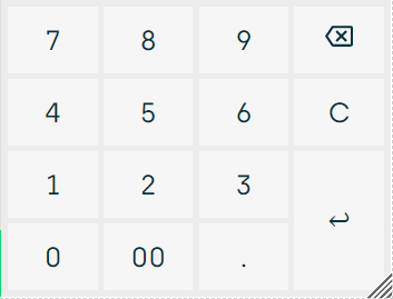
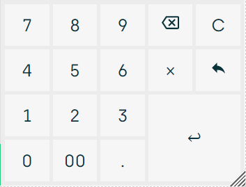
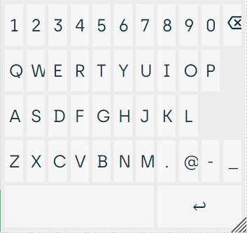
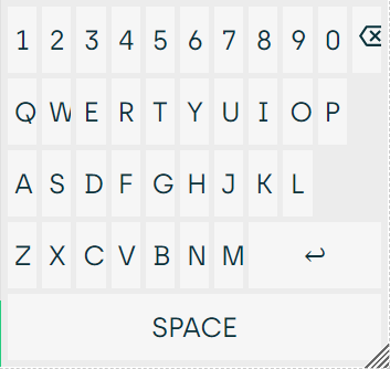
Keyboard: Adds a keypad to the layout. You can choose from various types of keypad, including these (sizes are examples only, you can change keypad sizes in keypads' properties):
-
NumberPad: A simple keypad
-
NumberPadFull: A keypad with more keys
-
Email: Contains the keys required for sending e-mails, notably a readily accessible @ key
-
AlphaNumeric: A keypad with numbers as well as letters
-
-
Label: Use to add labels, such as text labels, to a layout. The Label component is suitable for displaying static, simple, or frontend-specific text. To dynamically load text from the POS system' server, use the Async label component (described in the following).
You can choose from these types of label:
-
Text: A text label that can be translated
-
Time: Displays current time in HH:mm format
-
DateTime: Displays current date in dd/mm-yy HH:mm format
-
Countdown: A time counter, for example for counting down the number of seconds that customers have to complete card payment
-
UserIdentity: Displays whether the till is online or offline
-
Version: Displays the version of the layout
-
Cashier number: Displays the logged-in shop assistant's ID
-
Store number: Displays the store's ID, which can be useful if you have tills from several stores under the same roof, for example in a department store
-
POS number: Displays the till's ID
-
Receipt number: Displays the receipt number of the ongoing purchase
Receipt numbers are unique, so even if a customer's ongoing purchase ends up being canceled and you don't issue a receipt, the receipt number will remain in logs, etc. as evidence that the purchase order took place, even though it was canceled and didn't lead to a completed sale.
-
Session: Displays the current day's session number
-
Diagram name: Can be helpful to display in case users require support
-
Diagram version: Can be helpful to display in case users require support
-
LocalDepositAmount: Displays amount in local currency deposited to a cash management system (CMS)
-
ForeginDeposit: Displays amount in foreign currency deposited to a cash management system (CMS)
-
-
Async label: A label type with JavaScript support that dynamically loads text from the POS system's server. See also Label in the previous.
-
List: A generic list component that you can configure to display specific list data.
In the list component's properties, you can point to general query (GQ) endpoints to display such query results in the list component.
-
Login: A login dialog that lets supervisors and shop assistants log in to the till.
Technically, when the login component is used, it makes Poll API send TriggerSignOn and then POS UI call Receipt API to get login information from the till.
-
Message display: Displays messages from the POS system, typically information, warning, or error messages. You can set up this component for till displays as well as for customer-facing displays.
Technically, the component receives texts from TriggerOperatorDisplay and TriggerCustomerDisplay events in Poll API.
-
Navigation bar: Makes it possible for the user to navigate back to the previous step or layout.
-
Prompt: A component that prompts the shop assistant to react on something, for example an error, a membership card that needs to be scanned, a serial number that must be entered for a warranty certificate, a reason code to select, a reminder to ask for the customer's postcode, or similar. There are 100+ different prompt types.
Because the prompt component doesn't take up any space on the layout, the only way to edit it is to right-click it in the Explorer section in the left side of the POS Designer and then select Edit.
-
Stack: Works as a container for other components and serves as the root container for all other components.
A POS Designer layout is actually a stack, and when you add a layout, it's prepopulated with an initial number of stack components (for example three stacks in a three-column layout), but you can add further stack components if required.
-
Spacer: Use to create a configurable amount of space between other components in a layout.
When you've selected the required type of keypad, you can specify further settings, such as disable long press on keys and disable ripple effects.
Action components
-
Button: Use to make configurable user events (log in, sign in, submit, delete, etc.) occur. When users click the button, the required event will occur and the appropriate system action will then be triggered.
-
State button: A button that can have multiple states to reflect the current state of an endpoint based on matching conditions.
-
Button group: Adds a group of related buttons that are displayed together, for example two buttons where one enables an external keyboard and the other disables it.
-
Menu: Displays menu items either as a list or as a
 menu. Menu items can contain children, so that a menu item can expand into one or more subitems if required.
To build up a menu hierarchy, add a placeholder menu component, and then add additional menu components under the placeholder menu component as required.
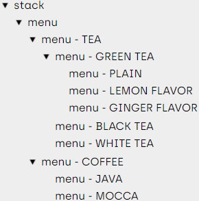
You define each menu item's action, event, or navigation in the menu item's properties, under Action or Event & navigation.
-
Panel buttons: A dynamic type of menu, where menu items and their actions, events, etc. are configured in the backoffice part of the POS system.
Technically, Poll API sends TriggerPanelButtons and then the web POS UI calls Receipt API to get panel buttons information from the till.
Panel buttons can also contain children, so that a menu item can expand into one or more subitems if configured in the backoffice part of the POS system.
-
Total: Displays the total price of the articles from the journal. You typically associate the Total component with an action that triggers a payment layout, so users can tap the total component to begin the process of receiving payment.
-
Grid menu: Displays menu items in a grid. See Menu in the previous.
Notification components
-
Network state: Shows an icon that indicates if POS is connected to the network or not.
The network state component is visible on the layout, but the only way to edit it is to select it in the Explorer section in the left side of the POS Designer and then select the edit icon.
-
Notification hint: Displays notifications as a temporary pop-up bar about an occurred event.
Technically, the notification hint is based on the Material Design Snackbar component. If used on Android, the notification hint will be based on Material Design's Toast component.
-
Notification host: Hosts the notification hint (see the previous) to trigger it and display temporary pop-up bars about occurred events. This component doesn't occupy any space on the actual layout.
Because the notification host component in many cases doesn't take up any space on the layout, the best way to edit it is to select it in the Explorer section in the left side of the POS Designer and then select the edit icon..
-
Notifications: Provides a list of events that have occurred on the till. It initially displays a badge (that is small autoupdatable status descriptor element) with the number of occurred events, and when the user taps the badge, it displays the events in a menu-like list. Like the notification host component, this component can also host the notification hint to display temporary pop-up bars about occurred events.
Form components
-
Autocomplete: Provides autocomplete field with scripting support to fetch data and populate the field with an initial value. Useful, for example, for quickly finding a contact person from a list so that the shop assistant can add the selected contact person to an invoice.
-
Boolean: Provides checkboxes, for example for selecting a currency or a discount.
-
Form: Gives the ability to have input and/or selection fields for users to provide input during till operations, for example to enter a quantity.
-
Input: Provides an input field with optional input validation.
-
Select: Provides a dropdown list for selecting between predefined input options.
-
Text area: Gives the ability to enter multiline text.
-
Quantity stepper: Provides plus and minus buttons to quickly enter, for example, the number of bananas that a customer buys.
Advanced components
-
Carousel: A carousel is a space-saving component that's primarily meant for use on layouts for smaller devices, where it can display multiple other components, typically browsers, in a single side pane. Shop assistants can then swipe to move between the carousel's content.
You can only use the carousel component on the layout type DrawerWithCarousel. When you create such a layout, it automatically contains a carousel component, which you can then edit to match your needs. That's why, unlike other components, you can't drag the carousel component onto a layout from the toolbox.
In a carousel component, you can select to initially display a content child page with the setting displayIndex.
-
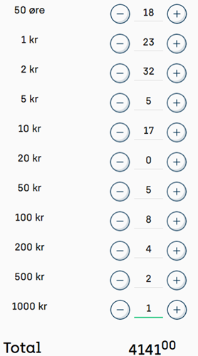
Cash statement: An interface that helps operators quickly count cash (coins, notes as well as bags/rolls of coins) and automatically calculate the total amount.
-
Drawer:A drawer is a space-saving component that's primarily meant for use on layouts for smaller devices, where it can display collapsible side-content on small section of your layout. The content is often menu navigation, but it can be any content.
You can only use the drawer component on the layout type DrawerWithCarousel or DrawerWithStackPanel. When you create such a layout, it automatically contains drawer components, which you can then edit to match your needs. That's why, unlike other components, you can't drag the drawer component onto a layout from the toolbox.
-
General query: Also known as GQ. Provides ID-based query features, for example for looking up old receipts, sold articles that customers want to return, etc.
-
Language selector: If your layouts are available in more than one language, this component lets users switch between available languages. You can set up the language selector to display text or flags.
You define the languages themselves, and all of their required texts, in JSON format under Locales - i18n in the Resources section in the left side of the POS Designer. Read more in Manage ViKING POS Designer languages. Once you've defined the required languages, the language selector knows about available languages, so you don't have specify the languages in the language selector itself. If you've defined a language that you don't want the language selector to display, select the language selector in the layout, and then select the unwanted language in the Basic properties' Hide flags field to hide it.
-
Monitoring: Makes it possible to monitor the actions that take place on other tills, typically self-service checkouts (SCOs) that you want to be able to keep an eye on, by specifying the IP addresses of the required tills. The component then displays the actions of those tills in a 2×2, 2×3, or 3×3 grid layout.
The monitoring component displays actions that take place on the required tills, such as article being scanned, waiting for payment, errors, etc., so that your staff can quickly help out if problems occur on the tills. It's not in itself a surveillance solution that can help you prevent theft, etc.
While the monitoring component is typically used to monitor actions on self-scanning tills, it can also be useful for monitoring a till that's operated by a new or inexperienced employee, so that an experienced colleague can quickly help out if problems occur on the till.
Local legislation may require you to notify customers and/or employees if you monitor the tills that they use.
-
Monitoring tabs: Makes it possible to monitor other tills, typically self-service checkouts (SCOs), in order to automatically get alerted when specified events occur on the monitored tills
For information about how to set up the monitoring tabs component, see Manage monitoring tabs in ViKING POS Designer.
-
Tab group: Organizes content into separate views (tabs) where only one view can be selected at a time.
You can choose which tab should be displayed initially, you can position tabs at top, bottom, etc., and you can store tab states.
The tab group component is for general organization of content, so it serves a different purpose than the monitoring tabs component (see the previous).
-
Video player: Displays video in layouts. You typically use it to display playlists of advertising videos on customer-facing layouts, but you can use the component on other layouts as well, for example to display a fire drill procedure video or to add life to a login layout.
When you insert the video player component on a layout, the player initially has a black background that makes it difficult to see where the component's menu (edit, move, etc.) is. Place your pointer in the top right corner of the player to access the menu.
The video player can play local video content as well as video content from a URL. If you want to play local content, you must add the required video as a resource before you can select it. To select the required video source in the video player component's properties, expand the Basic section, click Edit playlist, and select the required Resource or specify the required URL.
You can add multiple video sources and drag
 them up/down to put them in the required sequence.
 -
View group: Displays articles in a grid view in which users can tap required articles to add them to the journal. The component is typically used for articles that don't have barcodes, such as bread, fruit, and vegetables. If required, you can arrange articles in categories that can contain multiple levels. Learn more in Set up view group component on ViKING POS Designer diagram.
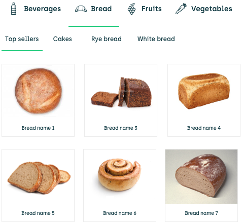
Example of view group with articles arranged in multilevel categories. Click thumbnail to view image in full size.
Edit a component's properties
It's a component's properties that make it look a particular way and/or make it do something specific. That's why, when you add a component to a layout, you'll typically want to edit the component's properties, such as size, color, actions, etc.
You can edit a component's properties in two ways:
-
Place your pointer in the top right corner or the component, click
 and then select Edit in the menu.
 -
In the Explorer section in the left side of the POS Designer, select the required component and then click
 .
.This method is especially useful for small or narrow components, like dividers, where it's difficult to use the other method.
You can add many different components to a layout, and each component may have a large number of properties. Also, exactly which property values, such as actions, etc. are available in your organization may depend on your individual organization's workflows. That's why it doesn't makes sense to document every component property here. It makes better sense to look at some particular properties that you're likely to work with over time:
Visibility
Many components have a Visibility property. It's typically part of the component's Basic properties. Example:
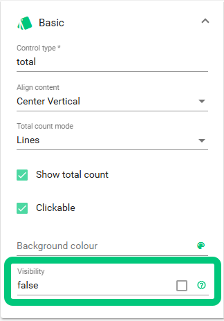
For example, the Total component has a Visibility property.
The Visibility property controls if and when the selected component should show up when people use your layout. Depending on the selected component, you typically have a large number of visibility options, from simple true/false to more advanced expressions that, for example, require a particular input state for the component to show up.
Example: You might in some cases only want the Total component to show up if the total amount is positive.
That's why the Visibility property in many cases has a  icon that you can click to read more about your options, how to write expressions, etc. in the built-in POS Designer syntax help window.
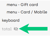
If you select a component's whose visibility property is set to false (that is non-visible), an icon  will denote this in the Explorer section in the left side of POS Designer, like in this example where a Total component's visibility is set to false:
Size
Most components have Size property group with a number of properties that control the component's height, width, etc. You can specify the size properties using familiar units, like pixels (px) and percent. But what do relative units like vmin, vmax, and vw mean? And what are font-relative units like em, rem, or ch?
A great place to learn about the size property units, and try out their effect, is W3Schools.
Accessibility
All components in POS Designer have an Aria-label setting in their Basic properties.
With aria-labels, you can provide short component descriptions that can be caught by screen readers and help visually impaired users.
Learn more about accessibility labels, including Aria labels, on W3Schools.
When you specify accessibility labels, including aria-labels, try to describe things so they match the user's perspective and needs. On a search field, for example, it may be tempting to specify Enter search term, but such a label provides little help if the user doesn't have any other clues that help them find where the input keypad is located. That's why it's often a good idea to specify accessibility labels together with people from the community that you want to serve.
Arial-labels can be very helpful, especially for describing complex components, but don't use Aria-labels as substitutes for bad user interface texts on simple components. For example, a clear and concise button text is always preferable over an aria-label, and it also reduces maintenance when you don't need to maintain a component's description in several places.
If you're in doubt about other component properties, ask your Fiftytwo consultant.
© 2026 Fiftytwo A/S • Disclaimer
Last update: 29 May, 2026 12:21:08 CET
Share this page with your colleagues: