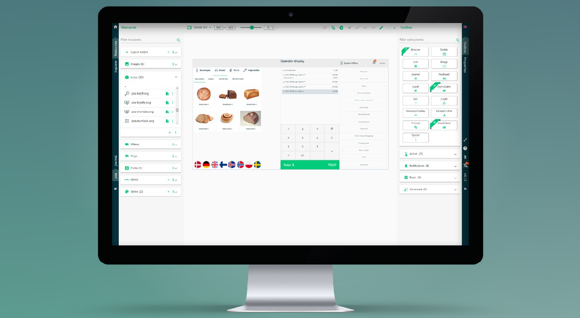
52ViKING POS Designer is a browser-based tool for drag-and-drop design of web user interfaces for 52ViKING points of sale (POSs).

You can design user interfaces (UIs) to support all the workflows that your organization needs for:
-
Stationary and mobile POSs
-
Every size of display (16:9 screens, 4:3 screens, tablets, mobiles)
-
Every type of POS (staffed checkouts, self-service checkouts (SCOs), information desks, customer-facing displays, unmanned stores, etc.)
-
Every role in your stores (shop assistants, fixed and floating operators, supervisors, managers, etc.)
-
Every chain in your organization
-
Every country and language that your organization operates in
Be in complete control of your POS UI design
Designing is this easy: Drag the required UI component, for example a button, a menu, or a keypad, onto the required position on your layout. Specify its properties (size, color, text, action, etc.) and save. Repeat until you’re happy with your POS layout.
Combine different layouts to make them work together, transparently and intuitively, to support all of your organization’s workflows: Logging in, selling articles, taking payment, handling returns, onboarding customers, completing cash statements, etc. Your staff and customers simply get the features they need in any given situation.
Choose between more than 60 different UI components, including advanced components such as:
-
View group with ‘PLU buttons’ for selling articles without barcodes as well as articles that are difficult to scan
-
Video player that’s typically used for displaying playlists of advertising videos on customer-facing layouts
-
Monitoring that lets supervisors monitor actions that take place on other tills, for example self-scanning tills that you want to keep an eye on
-
Cash statement that helps operators quickly count cash – even across currencies – and automatically calculates the total amount
-
Notifications that can inform users about anything from network status to customer age requirements
Mobile POS-ready: Organize busy layouts with tabs, carousels, or collapsible side menus for users to easily access all POS features even on small displays.
Customize your organization’s look, feel, and languages: Add your own logos, images, icons, styles, colors, fonts, scripts, etc. In multilanguage environments, you can easily handle translations of language versions in 52ViKING POS Designer itself, or you can export/import language files to/from your preferred translation agency.
Publish easily: Publish your new or updated POS UI designs directly from 52ViKING POS Designer to your preview, test, or production environments.
Technical requirements
-
Standard browser
-
Minimum 1024×768 px display (full HD (1920×1080 px) recommended)
Three POS Designer concepts that you need to know
When you work with POS Designer, you need to be familiar with three basic concepts:
-
Diagram: A POS Designer diagram is a user interface design that supports all the workflows that your target groups need. You'll typically only have one diagram, but if your organization owns several chains of stores, you may design separate diagrams for each chain to reflect each chain's workflows, branding, etc.
-
Layout: A POS Designer diagram consists of a number of layouts. A layout contains what's required for a particular workflow. You may, for example, create a layout for logging in to a till, a layout for selling articles and accepting payment, etc. You'll typically end up with a number of layouts in your diagram, and the layouts can then refer to each other so that you can transparently offer even complex combinations of workflows.
If required, you can design the same layout in different variants for use on mobile phones, tablets as well as 4:3 and 16:9 POS screens.
-
Components: The elements of a POS Designer layout are called components. Typical examples of components are buttons, menus, keypads, status notification texts, etc.
Templates to get you started quickly
52ViKING POS Designer comes with ready-to-use template diagrams that helps you quickly create POS user interfaces for:
The templates contain what's necessary to get started, and you can easily customize them with your organization's own logos, colors, images, etc.

You can of course also add, edit, or remove layouts and components to add or change entire POS workflows once you've familiarized yourself with the templates.
Best practice tips
-
Start by planning your design: You use POS Designer to create user interfaces that support your organization's workflows. That's why it's a good idea to carefully analyze the required workflows, and make sketches of those workflows, before you begin to use POS Designer. That way, you'll better be able to plan your diagram's layouts and their components as well as how they should work together.
You can view the time that you spend on analysis and sketches as an investment that'll will help you work efficiently when you begin to design the actual user interfaces in POS Designer.
-
Diagram: Once you've planned your overall design, open POS Designer and create a diagram. You can typically do that in less than one minute.
-
Layout and components: Then add a layout to your diagram. You can typically also do that very quickly. Then begin to add components to the layout. That's where the fun begins because that's where you add the actual till features.
-
Test: Once you've created your till user interface design with the use of diagrams, layouts, and components, remember to test your design with representative target groups, such as shop assistants, store supervisors, self-scanning customers, etc. Test feedback can often help improve even the most carefully planned designs.
Related: 52ViKING POS Designer diagrams
Related: 52ViKING POS Designer layouts
Related: 52ViKING POS Designer components
Related: 52ViKING POS Designer resources
© 2026 Fiftytwo A/S • Disclaimer
Last update: 30 March, 2026 14:06:31 CET
Share this page with your colleagues:
 minute read