 minute read
View groups (also known as PLU buttons) are very common in retail. They're made up of buttons that users can tap to sell or buy an article without having to scan it or enter its article number. The buttons typically have images or icons for ease of use.
You can also set up view groups with the Fiftytwo Master Data API (see api.fiftytwo.com). Note, however, that the API only handles view groups on an enterprise level. If you need to set up dedicated view group buttons for use in a single store, for example in order to sell local produce in the store, you must use a combination of POS Designer (see the following) and Store Management (see Set up view groups (PLU buttons) in ViKING Store Management).
View groups explained
View groups are convenient for shop assistants (for selling articles) as well as customers (for buying articles on self-service displays).
Use case examples
-
Supermarkets use view groups on shop assistant displays for selling articles that don't have barcodes, such as bread, fruit, and vegetables.
-
Supermarkets use view groups on their self-service checkouts (SCOs) so customers can themselves buy bread, fruit, vegetables, and other articles without barcodes.
-
Many hardware and DIY stores, garden centers, etc. use view groups because some of their articles are so bulky that they're difficult for staff to scan, even though the articles do have barcodes.
-
Many quick service restaurants (QSRs) use view groups on their customer self-service displays. The images on the view group buttons make it easy for customers to make their selections.
Additionally, view groups work excellently with the modifiers often used in QSRs. Modifiers are aspects of an article that can be changed for each order to suit the customer's preferences, for example a burger without tomatoes, but with extra cheese – read more about that in Add/remove modifiers in ViKING POS.
Groups and hierarchies
The buttons in a view group are typically grouped by article type, and may contain several levels of groups and subgroups.
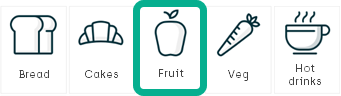
Here's a very simple example of a view group with articles arranged in a multilevel hierarchy that has five groups at the top level. Let's assume that you're a shop assistant who must sell an apple (or a customer who's going to buy an apple – the experience is the same):
-
On the top level of the hierarchy, you tap the Fruit group:
-
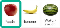
In the Fruit group, you then tap Apple:
Of course, users need to be able to sell or buy more than one apple, so we might also need to set up functionality for defining quantities, but otherwise we'll primarily look at setting up the basic structure and look of the view group component in POS Designer, so that your organization will have a placeholder view group that it can use as a template.
That way, your store manager colleagues can themselves use ViKING Store Management to set up view groups with the exact articles, groups, and hierarchies that they need for their stores.
POS Designer: Add view group component to diagram
If you're using one of POS Designer's built-in diagram templates, they all have a view group component added on relevant layouts by default. In that case, you can begin at step 6 of the following process.
-
In the left side of ViKING POS Designer, select Explorer.
-
In the Diagram menu, select the required diagram.
-
In the Layout menu, select the layout that you want to add the view group to. It's typically the journal layout.
-
In the right side of POS Designer, select Toolbox, and expand the Advanced section.
-
From the Advanced section, drag the ViewGroup component to the required position on the layout.
The view group component has some dummy content. The dummy content will not appear on actual displays, but it's helpful when you're going to edit the view group's look in the following steps.
-
On the layout, make sure that the view group component is selected (so that it gets a narrow, blue dotted border around it). Then make sure that the Properties tab in the right side of POS Designer is selected.
-
On the Properties tab, use the sections Layout navigation and Global prompts to select any navigation scripts and prompts to use with the view group.
-
Then use the following sections to edit the view group's colors, fonts, button sizes, etc. to suit your organization's needs.
To simplify things, the view comes with some default settings.
These are the most important default settings of a view group:
-
Display price of articles: Yes
-
Let users select variants and modifiers (if relevant): Yes
-
Display quantity selection dialog after users tap article reference button: No
Without a quantity selection dialog, users will have to, for example, tap an Apple button four times to sell four apples. For an experienced shop assistant this can sometimes be faster than using a dedicated quantity selection dialog. However, we recommend that you use a quantity selection dialog for self-service checkout (SCO) tills.
-
Display search field: No
-
Size of thumbnail images on buttons: 100 px wide, 80 px high
-
Tab levels: 3
-
Go back to hierarchy's top level after sale completed: Yes
If you want to use other settings than the defaults, you can change them in the following sections on the Properties tab:
-
Basic: Determines basic behavior of the view group, such as:
-
The ID of the view group. Together with the name of the diagram on which you're setting up the view group, the View group ID is used for pinpointing which tills the view group should be displayed on.
-
The required number of tab levels (see also the Tab settings section). If you don't want tabs on the view group, set Levels to 1.
The basic settings also determine whether or not to:
-
Show price on articles
-
Display a quantity selection dialog when users tap an article in the view group (recommended in most cases)
-
Go back to the view group's top level before new transactions (if the view group uses a multilevel hierarchy)
-
Include a search field
-
Display modifiers (for example Extra cheese or No tomatoes) if you use modifiers in your organization
-
-
Grid settings: These settings control the look and layout of the view groups' buttons. That's because the buttons are essentially defined by a grid where the grid's settings determine how the buttons will appear.
You can specify size properties using familiar units, like pixels (px) and percent. You can also use relative units like vmin, vmax, and vw. A great place to learn about size property units, and try out their effect, is W3Schools.
The dummy content in the view group component reflects your changes in real time, so it's easy to view the effect of each setting if you change their properties.
Examples:
If you use a solid gray Border setting like 1px solid #bcbcbc, the Border radius setting will determine the rounding of the buttons' corners.
If you use Thumbnail width and Thumbnail height settings of 0px or 0%, the dummy thumbnail images in the view group component will disappear (that's a way of preventing images from being displayed on view group buttons). -
Grid font: Font settings for the view group's buttons. You can define font settings separately for:
-
Article text
-
Price (if you have selected to display price (under Basic settings))
You can specify size properties using familiar units, like pixels (px) and percent. You can also use relative units like vmin, vmax, and vw as well as font-relative units like em, rem, or ch. A great place to learn about size property units, and try out their effect, is W3Schools.
-
-
Tab settings: Some organizations use tabs instead of buttons for displaying groups in view group hierarchies. Example of a view group with tabs:

The tab settings determine the position and look of the tabs, except for tabs' font and padding/margin that have their own settings (see the following).
-
Tab font: Font settings for tabs only.
-
Tab padding and margin: Padding and margin settings for tabs only.
-
Size: View group size settings.
Depending on where you've placed the view group component on the layout, it's often a good idea to leave the Match parent box selected because that'll then automatically determine how much the view group component can grow relative to other flexible components in the same container.
You can specify size properties using familiar units, like pixels (px) and percent. You can also use relative units like vmin, vmax, and vw. A great place to learn about size property units, and try out their effect, is W3Schools.
-
Padding and margin: View group padding and margin settings.
-
Border: View group border settings.
-
-
When you're ready, click
 in the top bar to save your changes.
Your diagram now contains a layout with a view group component that matches the look and structure that you've defined. The view group component that you've defined will act as a template that'll determine the view groups' position, size, colors, etc. on POS displays in the actual stores.
-
Test the diagram, and then publish the package (see ViKING POS Designer diagrams)
In ViKING Store Management, store managers can now configure their actual view groups and add the required articles and group hierarchies to them. See Set up view groups (PLU buttons) in ViKING Store Management.
Provide information to store managers
When you've set up the view group template, provide some basic information to the store managers who are going to do the remaining setup of their actual view groups in ViKING Store Management.
If you've simply used the view group template’s default settings, all you need to inform store managers about is:
-
the name of the diagram for which the view group template was designed
-
the view group ID for which the view group template was designed
If you've changed some of the view group template's default settings, its' important that you tell store managers which default settings you've changed, for example if you've changed how images will be displayed.
Related: ViKING POS Designer diagrams
Related: ViKING POS Designer layouts
Related: ViKING POS Designer components
Related: Set up view groups (PLU buttons) in ViKING Store Management
© 2026 Fiftytwo A/S • Disclaimer
Last update: 29 May, 2026 12:21:08 CET
Share this page with your colleagues: